London in Three Dimensions
Two 3D maps from Threshold: one showing where London is most expensive by the square foot, the other showing where buyers pay more or less than distance from the centre would predict.
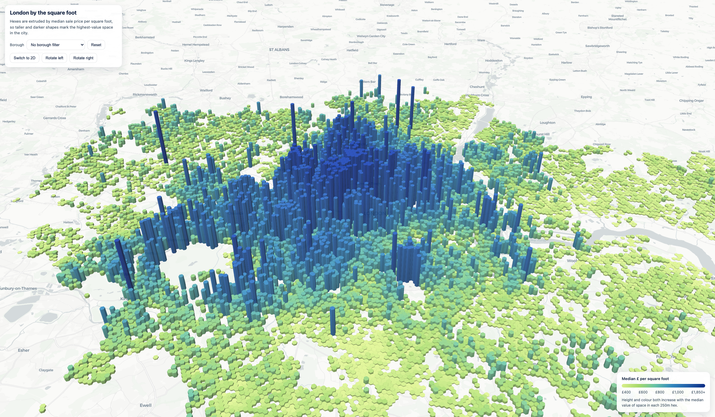
In the last post I shared four 2D maps from Threshold, the hedonic LightGBM model behind thresholdvaluation.com. The most-read of them was the orientation map: median price per square foot, by hex, across London. Several people asked the same question about it. The flat hex grid hides the gradient. You can see where the expensive areas are, but you don’t get the topology of the price surface.
So I rebuilt it in three dimensions. And then, because the obvious follow-up question to “where is London expensive?” is “why is London expensive there?”, I built a second 3D map that tries to answer it.
London by the square foot
The first map is the same data as before, extruded. Hex height and colour both scale with median GBP per square foot.
The skyline is the story. Mayfair, Knightsbridge, Belgravia, and Chelsea form a single dense cliff in the central west, with a smaller spike pushing north through Hampstead and Highgate. Everything else slopes down. Inner London is a plateau in the GBP 700-1,000/sqft range; the outer suburbs sit closer to GBP 400-500.
This is roughly what every Londoner already knows. The 3D form makes the steepness of the central premium legible in a way the flat map didn’t. The cliff between Mayfair and the rest of zone 1 is real and sharp. The view also makes it obvious how localised the very top of the market is. Most of the dark blue you see is contained in a handful of postcodes.
A useful map, but not a surprising one. The more interesting question is what would be left if you took distance from the centre out of it.
What distance can’t explain
The second map is built around a simple null model: predict GBP/sqft using nothing but distance from central London. Then plot the residual: how much each hex’s actual price differs from what that distance-only baseline would expect. Red hexes are more expensive than distance predicts. Blue hexes are cheaper. Height scales with the size of the miss in either direction.
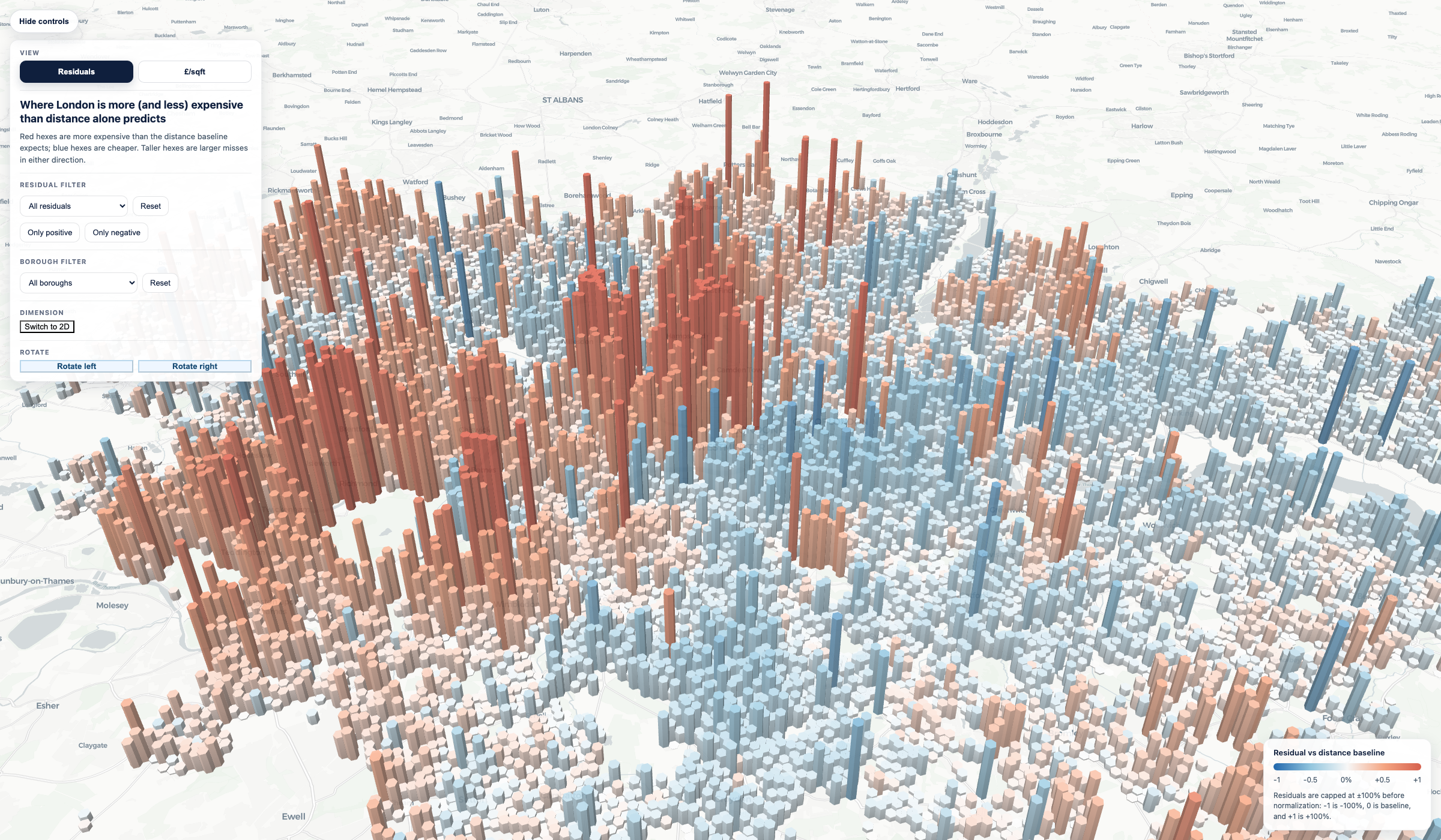
The asymmetry is what stands out. Red and blue are not mirror images of each other. The reds cluster tightly in two places: the central west prime market (Knightsbridge at +56%, Mayfair at +37%, Notting Hill at +35%, Chelsea at +24%) and a corridor of outer “village London” around Richmond, Twickenham and Teddington. Richmond is about +39% as a neighbourhood, while TW10, TW11 and TW1 are among the strongest district-level positives. Hampstead at +19% sits in the same family. These are places where buyers pay for something distance can’t see.
The blues are more diffuse and tell a different story. Camberwell sits at -27%, Croydon’s CR7 at around -30%, parts of SW9 around Stockwell and Brixton at -25%, and a long ribbon of inner south and east London (Peckham, New Cross, Deptford, Walworth, parts of Tower Hamlets) comes in roughly 10-25% under what its distance from the centre would suggest. These are areas that are geographically close to the West End but priced as if they weren’t.
What distance fails to capture is what makes London London. Prestige, architecture, schools, parks, streetscape, the perception of safety, the quality of the housing stock, the social geography of who lives where. The model has access to none of these directly. They show up as residuals.
The residual map is, in that sense, a map of everything a quantitative model leaves on the table. The GBP/sqft map shows the price surface. The residual map shows where the price surface bends away from geography: where reputation, identity, and history are doing the work that proximity can’t.
Closing
The 2D maps in the previous post were about what the model has learned. These two are about what it hasn’t. Distance is the cleanest single feature in London property data, and it explains a lot. But the places where it breaks down (central west, the Richmond corridor, the inner south and east) are where the interesting questions live.
Threshold is live at thresholdvaluation.com.