I Tried to Redraw America's Time Zones
Solving for the time zone map that fits the sun, and finding that tidiness is nearly free but barely helps the average person.
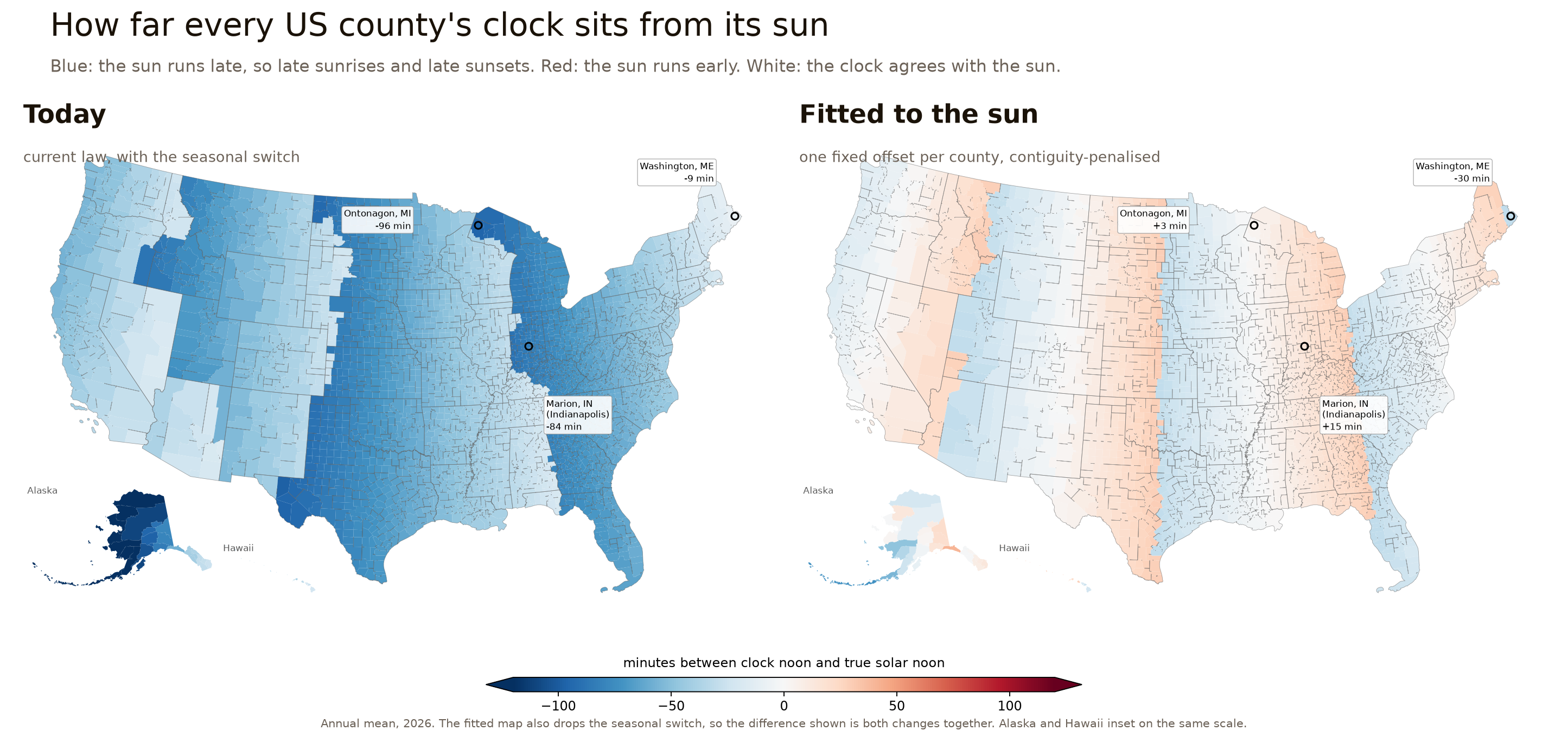
I spent a weekend trying to redraw America’s time zones to fit the sun. Two things surprised me, and one of them argues against the point I set out to make.
The maps above are the answer. On the left is where every US county’s clock sits relative to its own sun today. On the right is the same country with one fixed offset per county, chosen by an optimiser to fit the sun instead of inherited from a railway timetable. Blue means the sun runs late, red means it runs early, white means the clock and the sun agree.
Start with Indianapolis
On 15 June this year, the sun over Indianapolis reaches its highest point at 1:45 in the afternoon. Not noon. In January, with the clocks back, it peaks at 12:54.
Drive four hours west to Chicago and on that same January day the sun peaks at 12:00, almost exactly.
Both are Midwestern cities, less than two degrees of longitude apart. The difference is that Indianapolis is on Eastern time and Chicago is on Central.
That gap is what I set out to measure, and I’ll call it the signed solar offset: the distance between the clock’s noon and the sun’s noon. Chicago in January is zero. Indianapolis is 54 minutes.
Two things follow, and they are the whole argument in miniature.
Daylight saving makes the gap bigger, not smaller, in places like this. Indianapolis goes from 54 minutes out in winter to an hour and three quarters out in June. Every hour of DST pushes the sun’s noon later on the clock, so permanent DST would lock in the summer figure year round.
This is not about latitude. Anchorage has punishing winter sunrises because it sits at 61°N, and no law can fix that. The Indianapolis gap is different: it is purely a consequence of which offset the clock is set to, which is the only part anyone actually votes on.
A time zone is a step function laid over a smooth quantity. Longitude changes continuously as you drive west; clocks jump an hour at a time. The gap is the leftover, and no way of setting the clocks makes it zero.
Why this is worth measuring
“Your clock disagrees with your sun” is not self-evidently a problem, so it is fair to ask whether it does any harm.
The best evidence comes from studies that use time zone borders as a natural experiment: two towns a few miles apart, alike in most respects, on different clocks. Giuntella and Mazzonna (2019) find that an extra hour of evening light, which is what the western edge of a zone gives you, costs about 19 minutes of sleep a night. Gibson and Shrader (2018) follow that through to wages, and find an hour more average weekly sleep is worth about 1% in earnings in the short run. Argys, Averett and Yang, in the American Journal of Health Economics, use the same border design and put the cost of a substantial clock-to-sun mismatch at roughly a 6% higher incidence of depression.
Some louder claims in this area are contested, and it is worth being straight about that. A widely-repeated link between time zone position and cancer risk was re-examined in 2023 and did not hold up for overall cancer incidence. The sleep and wage findings are on firmer ground.
So: a real effect, modest per person, spread over a lot of people.
None of that observation is mine, incidentally. Chronobiologists have made this case for years, Roenneberg and colleagues most directly in 2019, and Stefano Maggiolo mapped clock-versus-sun offset for the whole world back in 2014. If the left-hand map looks familiar, that is why. Nor is the redrawing new in itself: a 2022 project already picked the best whole-hour offset for each US state using county populations and solar noon.
What I had not found was the same question asked at county level with the cost of a messy map priced in, which is the part that turns out to have a surprising answer.
How far off is everyone
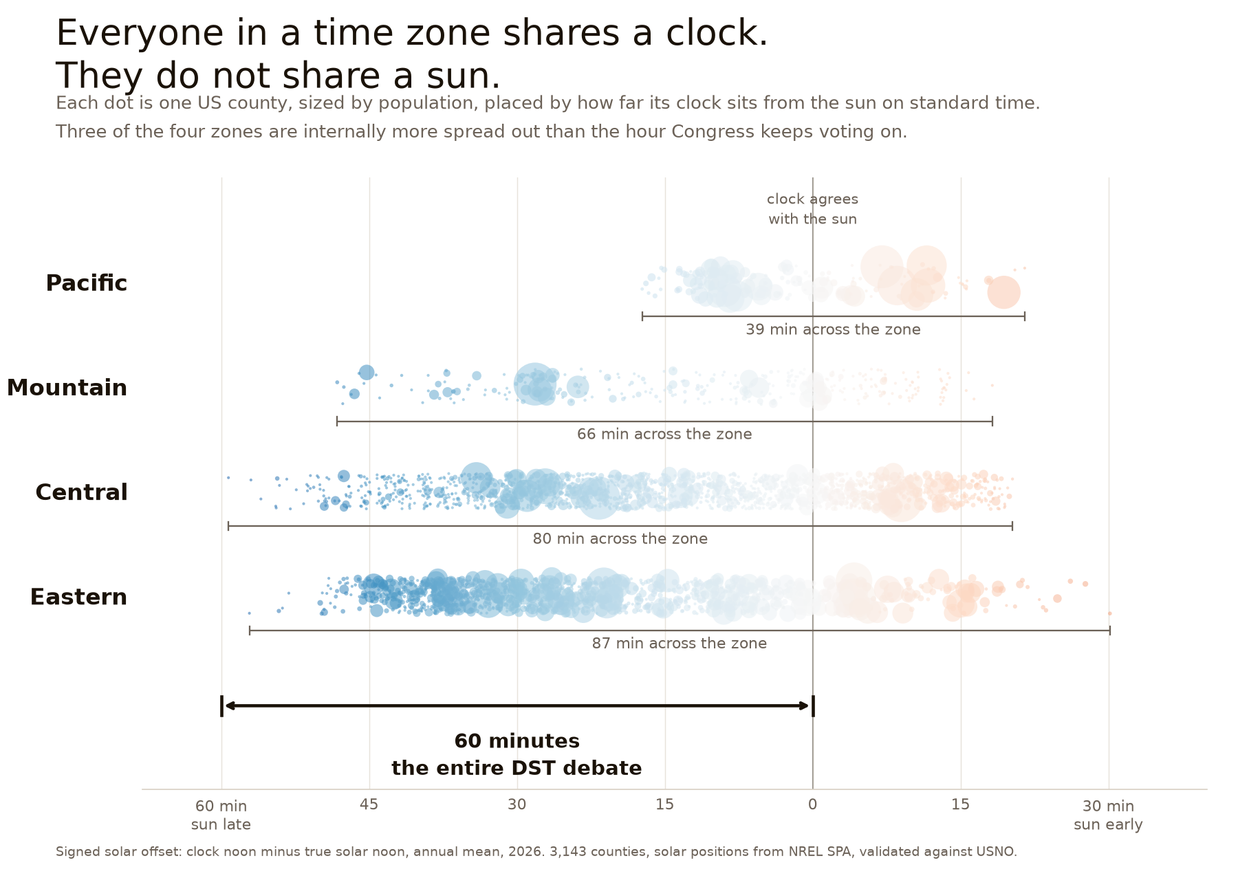
I computed the offset for all 3,143 US counties, every day of 2026, and checked the result against US Naval Observatory tables. [1] [4]
Washington County, Maine and Ontonagon County, Michigan are both on Eastern time. When the clock in both says noon, the sun over Maine passed overhead half an hour ago, and the sun over Michigan is still nearly an hour away. That is 87 minutes of difference inside a single time zone.
It is not just those two. Measured across each zone on standard time:
| Zone | Widest gap inside the zone |
|---|---|
| Eastern | 87 min |
| Central | 80 min |
| Mountain | 66 min |
| Pacific | 39 min |
Three of the four zones are internally more spread out than the hour Congress keeps voting on. Pacific is not, because it is the narrowest zone in longitude, and I would rather say that than have someone find it.
That is min-to-max, which invites the objection that the extremes are empty countryside. So here is the version that survives it: in each of the big three zones, the middle half of the population is spread across about 30 minutes. Half the disputed hour, just among the ordinary middle of one zone.
Set against that, here is what the two proposals actually do, counted in people whose annual average offset is more than an hour. That is a yearly average, not a claim that they are an hour out every day:
| People more than an hour out | |
|---|---|
| Permanent standard time | 149,000 |
| Current law | 115 million |
| Permanent DST | 226 million |
The 149,000 is worth pausing on: every one of them is in Alaska, where the main time zone is stretched across an enormous span of longitude. That one is a drawing problem, not a fact of the far north. Fitting the map to the sun takes Alaska’s average misalignment from 57 minutes to 6, and the number of people more than an hour out from 149,000 to about 5,000.
To be fair to permanent DST, it nearly abolishes the early-sunset problem: days with sunset before 5pm drop from 44 a year to essentially none. That is a real benefit and it is why people want it. The price is 136 days a year of sunrises after 7:30am, against 22 under permanent standard time. Both of those are population-weighted averages across the country rather than any one place’s experience. A trade, not a mistake. [2]
Solving for the map
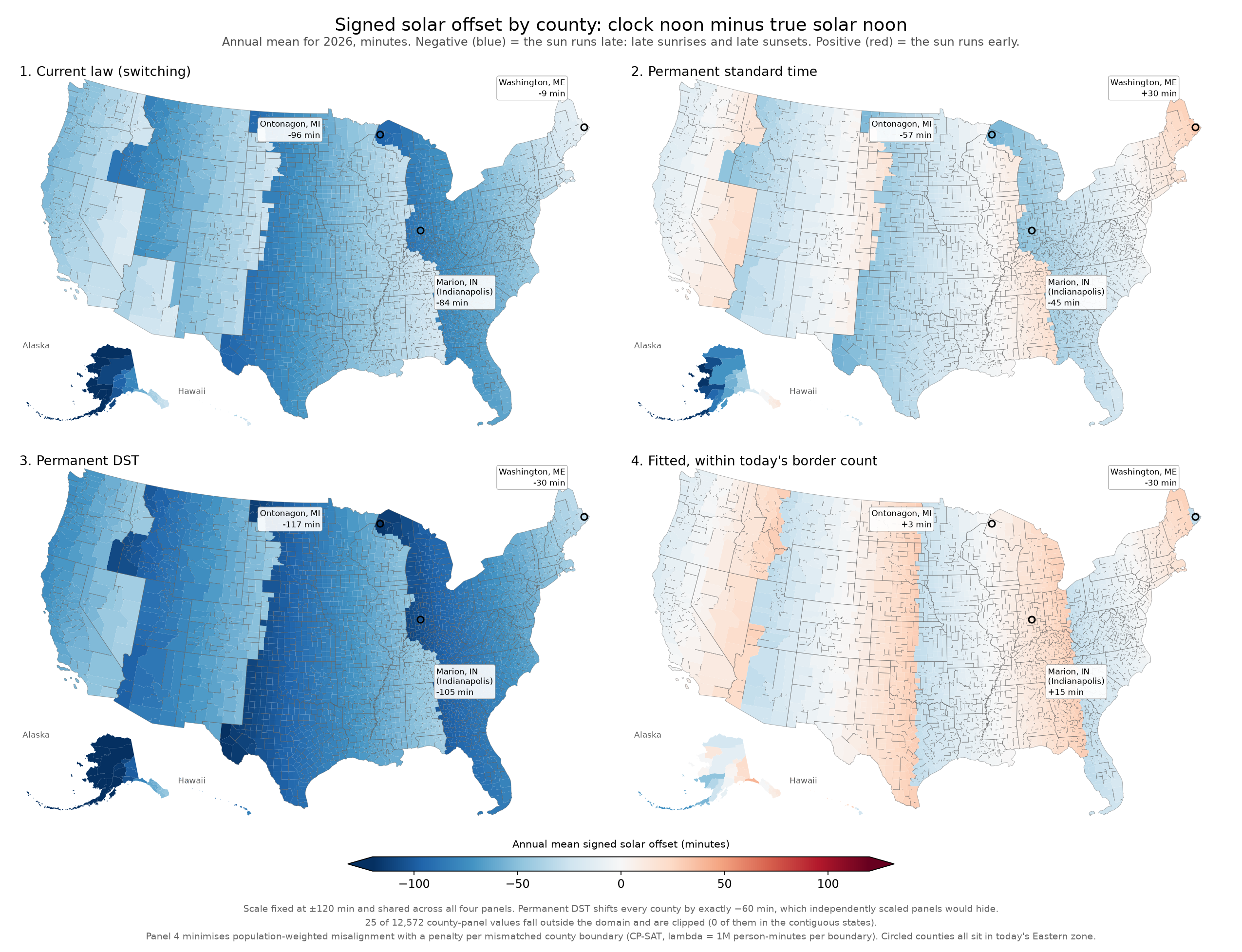
So: treat it as an optimisation. Give every county an integer offset, chosen to put as many people as close to solar noon as possible, and require the result not to shatter into confetti. Concretely, count the borders where two neighbouring counties disagree, and allow the fitted map no more of them than today’s map already has. [3]
Surprise one: keeping the map tidy is nearly free.
The obvious objection to fitting clocks to the sun is that you would end up with a patchwork nobody could live with. You do not. Longitude bands are naturally contiguous, so a tidy map and an accurate map are almost the same map.
Start with the count, because it is the part that needs no interpreting. Today’s zones disagree across 246 of the 8,933 borders between neighbouring counties. The fitted map on the right at the top of this post uses 241. It is not a compromise with tidiness; it disagrees across fewer county borders than the system we have.
The alignment it gives up for that is about half a second per person. Not half a minute. Half a second.
Across the lower 48 the fitted map is four clean bands, exactly as today’s is. It adds one zone at the eastern end: Washington County, Maine, the far tip of the state, moves to Atlantic time. That sounds like an oddity and is really just arithmetic finally being applied, since at longitude 67.5 west it has always sat almost exactly on the line, and it belongs on the Atlantic side of it by about seventeen seconds.
Surprise two: the average American barely gains. This is the one that argues against my own framing.
Today’s boundaries turn out to be close to as good as whole-hour offsets allow. Redrawing every line in the country moves the average American about 2.4 minutes closer to the sun. I had written a much more exciting sentence before I checked that number.
The gain is real, but it is concentrated. The number of people living more than half an hour from solar noon falls from 58 million to 2 million. So the case for redrawing zones was never that everyone gains. It is that a small minority is badly served and almost none of them need to be. That is a narrower claim than I started with, and I think it is the true one.
The hour is the wrong unit
Even the fitted map still spans 61 minutes inside its Eastern band. That is not the optimiser failing. Give every place its nearest whole hour and the set of places choosing any particular hour is a strip of longitude 15 degrees across, which is 60 minutes of solar time. So a well-fitted band covers about an hour by construction. Nothing forces a zone to be that wide, and Pacific is not, but nothing can make a full one narrower either.
Which is the tidiest way I can put the whole thing. The hour being debated is exactly the resolution of the thing doing the debating. Both sides are arguing about adding or subtracting one unit of a quantity whose bands are one unit wide to begin with.
What this is not
Solar alignment is not the only job a time zone does. Sharing an offset with the city you trade with is worth something real, and none of this measures it. The optimisation is a measuring instrument for how much of the misalignment is structural rather than chosen, not a proposal, and I am not campaigning for Indianapolis to join Central.
The number I keep returning to is that Indianapolis sunrise. On 31 October, the last full day of daylight saving this year, the sun there comes up at 8:12am. Nothing currently on the table moves that by more than an hour in either direction, and one of the two options makes it worse.
Notes
[1] How it was built. Census TIGER county boundaries, with the sun computed at each county’s Census centre of population rather than its geometric centroid. That distinction matters more than it sounds: a centroid for a large western county can sit tens of kilometres of longitude from where anyone actually lives, and since the metric is longitude-driven that would bias the result directly. Time zones are looked up from geometry at that point rather than from my assumptions, so Arizona, the Navajo Nation and the two dozen counties that straddle a boundary all fall out on their own. Worth being precise about which geometry, because there are two: the zone names are IANA, but the polygons come from OpenStreetMap and encode the clocks people actually keep, which is not the same thing as the legal boundaries in 49 CFR Part 71. That is the right input here, since the whole quantity being measured is the clock someone reads. Among the population-centre points both layers cover, they differ in exactly two counties, both in Alabama, both legally Central. Russell County largely keeps Eastern in practice because it belongs to the Columbus, Georgia economy. Chambers County is mixed, with Lanett and Valley on Eastern and much of the rest not, so there the point classification is doing real work and the legal answer might be the better one. Comparing against the Department of Transportation’s legal layer moves the national figure by 0.36 seconds either way. The check is in the repo. Solar positions are NREL’s Solar Position Algorithm via pvlib, over 1.1 million county-days, stored as UTC instants and converted to local clock time only at the end so that all four scenarios share one astronomical layer. Sign convention: clock noon minus true solar noon, so positive means the sun runs early. Code and data.
[2] Arizona and Hawaii. I model permanent DST as applying everywhere, including the two states that do not currently observe it. The real bills exempt them. I did it uniformly because it makes a cleaner comparison, with every county moving by the same hour, so the map shows geography rather than geography plus a carve-out. Exempting them leaves 8.5 million people, 2.6% of the population, where they are and pulls the national figures down slightly. It does not change the argument: both states sit around 27 minutes west of their meridians, middling by national standards rather than extreme.
[3] The optimiser, and how much to trust it. An integer program over the county adjacency graph, solved with CP-SAT: minimise population-weighted distance from solar noon, subject to using no more mismatched county borders than today’s map does. Stating it as a budget rather than a penalty matters, because it makes the claim prove itself. The fitted map is the evidence. It exists, you can download it, and you can count its borders. How much better some other tidy map might be is a separate question, and the solver’s unproven gap bounds only that.
So the honest split is: the existence claim does not rest on the solver having found the best answer, and the optimality claim gets no weight at all. This map is not the best possible map, and nothing here says it is.
Two things I had wrong while building this, both caught late enough to be worth recording. The objective originally rounded each county’s target to the nearest whole minute, which left seventy counties exactly tied between two offsets. The value of the objective was unique, so it looked settled, but the map achieving it was not, and every descriptive number I read off that map, its border count included, was really an arbitrary pick among equally good answers. Working in thousandths of a minute leaves no ties at all, and the unconstrained solution then reproduces plain longitude rounding exactly, which is the check that says the ambiguity is gone.
The second was a counting error in my favour. I had today’s map stranding three counties in enclaves. All three were Hawaiian islands, which have no land neighbours and are therefore their own region under any map whatsoever, including the one we already use. Excluding them, today’s map strands nobody, and the honest comparison is against zero rather than three.
The chosen map is committed to the repository with its SHA-256, alongside a script that recomputes its border, region, enclave and alignment statistics from that file without running a solver. That is a stronger guarantee than a reproducible search, because it survives a different machine, a different thread count and a future version of the solver, none of which a search does.
[4] The validation caught a problem, and it was not where I expected. I checked the solar calculations against published sunrise and sunset times for five sites spanning the failure modes. My first reference source failed by up to five minutes at Anchorage. But the pattern was diagnostic rather than alarming: solar noon agreed to within 2 seconds and civil twilight to 3, while only sunrise and sunset drifted, systematically, growing with latitude. That is not what a broken calculation looks like. I switched to USNO, the authoritative source, and found the convenient API was itself 95 to 231 seconds off on sunrise. The reference was wrong, not the code. That still left pvlib’s own sunrise helper drifting to 164 seconds at Anchorage near the equinoxes, with the sign flipping either side of them. Sunrise was fine, and that asymmetry ruled out a threshold error, since a bad threshold moves sunrise and sunset together. Computing the crossings from the hour angle instead brought the worst case to 37 seconds. Everything now sits within 68 seconds of USNO, of which about 30 is USNO’s own rounding to the minute.