What a London Property Model Has Learned
Four maps from Threshold, a hedonic LightGBM model for London property prices: where space is expensive, what an extra bedroom is worth, and where the model knows it's guessing.
I built Threshold, a hedonic property valuation model for London, that predicts sale prices to about 11.5% median absolute percentage error on a 180-day holdout. The model itself is the product. But once you have a trained model, you can ask it questions that are harder to answer with raw data alone. What does the model think space is worth in different parts of London? What does it think an extra bedroom adds? And where does it know it’s guessing? Four maps, one per question.
London by the square foot
Start with the simplest of the four. Each hex shows the median £ per square foot for nearby matched sales.
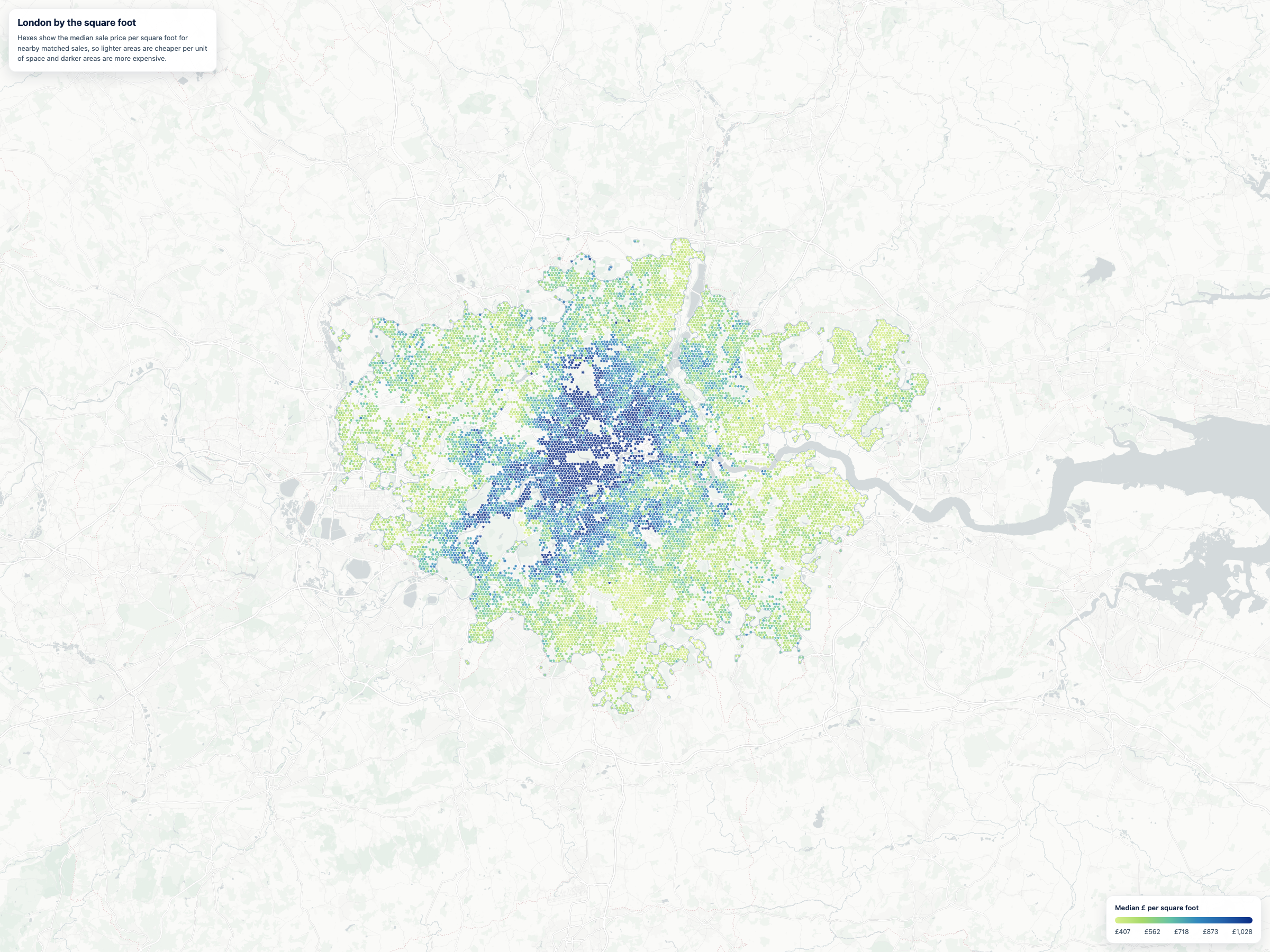
This is the map every Londoner would draw from memory. The dark central-west bullseye covers Mayfair, Knightsbridge, Belgravia, Chelsea, Notting Hill. A second cluster sits north around Hampstead and Highgate. Prices fade outward roughly concentrically. Nothing here is surprising, and that’s the point: it is a sanity check on everything that follows.
What an extra bedroom is worth
A more interesting question: rather than asking what a property costs, ask what the model thinks would change if it had one more bedroom. The map below shows the median modelled uplift from adding one bedroom while holding every other feature fixed. This is a counterfactual prediction, not an observed market price.
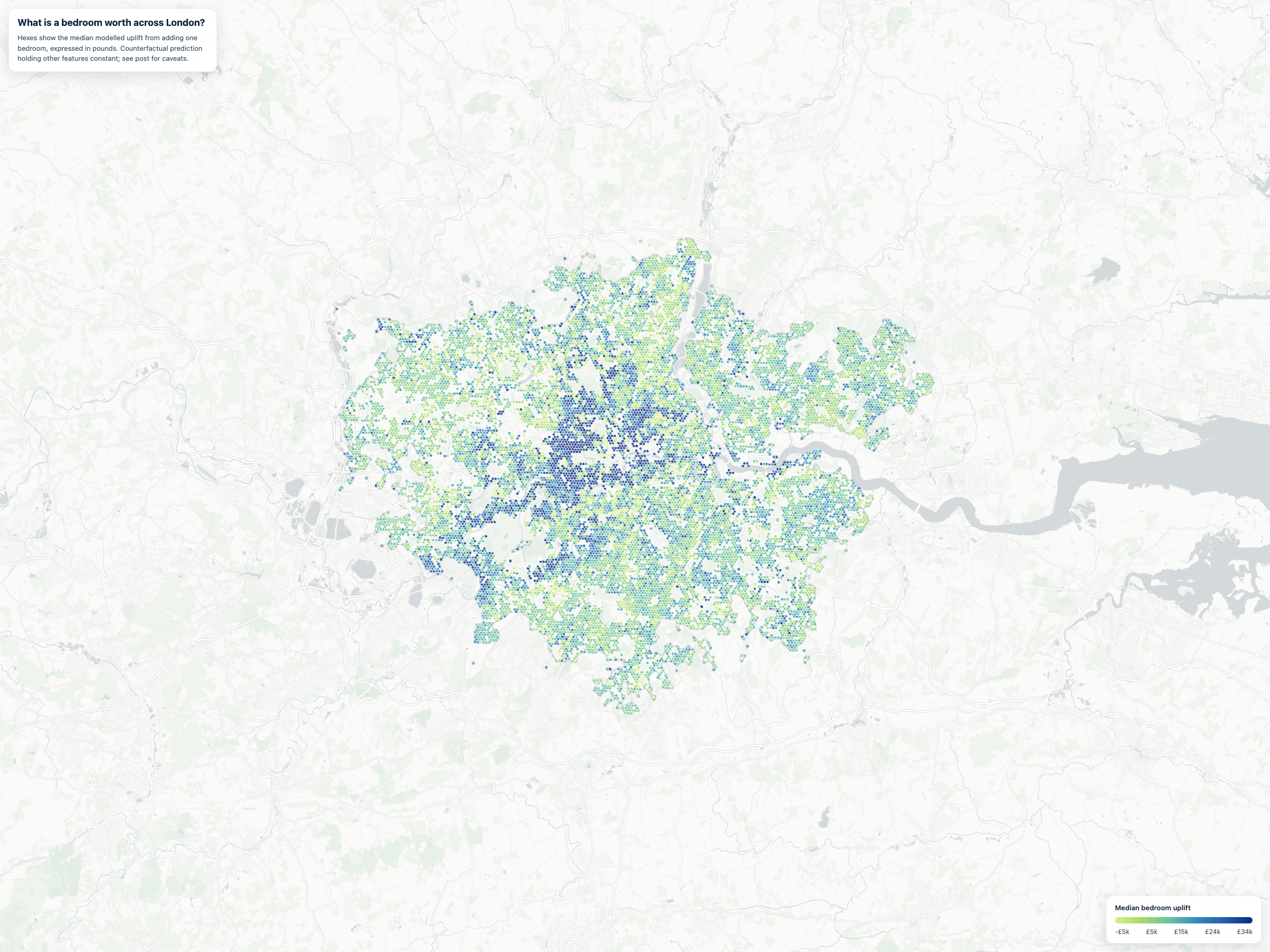
Prime central west dominates. A marginal bedroom in Mayfair or Belgravia adds about £28,000 in predicted price. In outer London, Croydon, Romford, Bromley, the same counterfactual move adds closer to £8,000 to £10,000. A 3-4x gap.
The model was never given an explicit bedroom-by-location interaction term. It learned the relationship from the data through tree splits, and the geography is what fell out. Part of the gap is a price-level effect. Part of it is property typology: what counts as a sensible extra bedroom in a Belgravia townhouse is a different transaction from one in a Croydon semi.
The percentage view tells the same story but more conservatively.
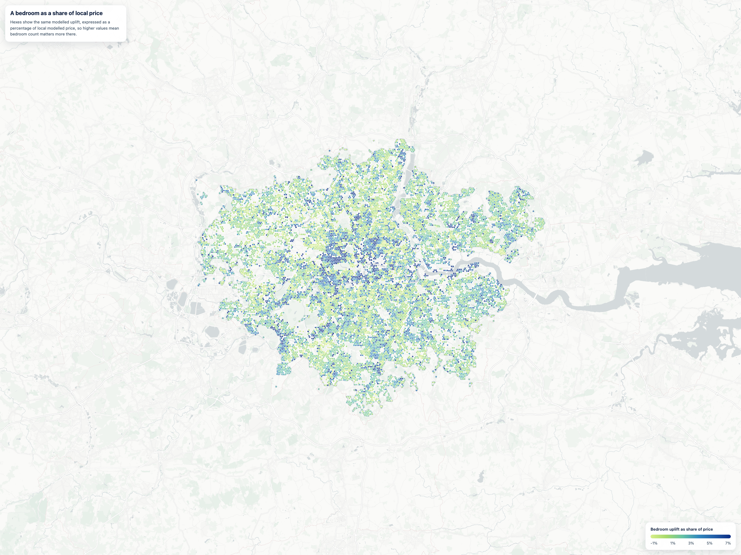
As a share of local price, the prime central premium narrows but does not disappear: about 3.5% in central west versus roughly 2% across the outer areas. The £ gap is not purely a price-level artefact. The model has learned that bedrooms matter more in prime central, even proportionally.
That caveat matters. This map does not show what buyers actually paid for an extra bedroom in observed transactions. It shows what the current hedonic model predicts would happen if the bedroom count were increased by one while keeping floor area, postcode sector, tenure and every other feature fixed. That makes it a useful way to probe how the model values room count, but it is not a causal estimate and it can become unrealistic for already unusual properties. The safe interpretation is “where the current model treats an extra bedroom as valuable”, not “the true market price of an extra bedroom”.
Where the model knows it’s guessing
Every prediction comes with an interval. The map below shows the median 80% prediction interval half-width per hex, expressed as a percentage of modelled price. Lighter areas are where the model is more confident; darker areas are where it is not. The intervals come from a stratified conformal procedure calibrated on the audited holdout residuals.
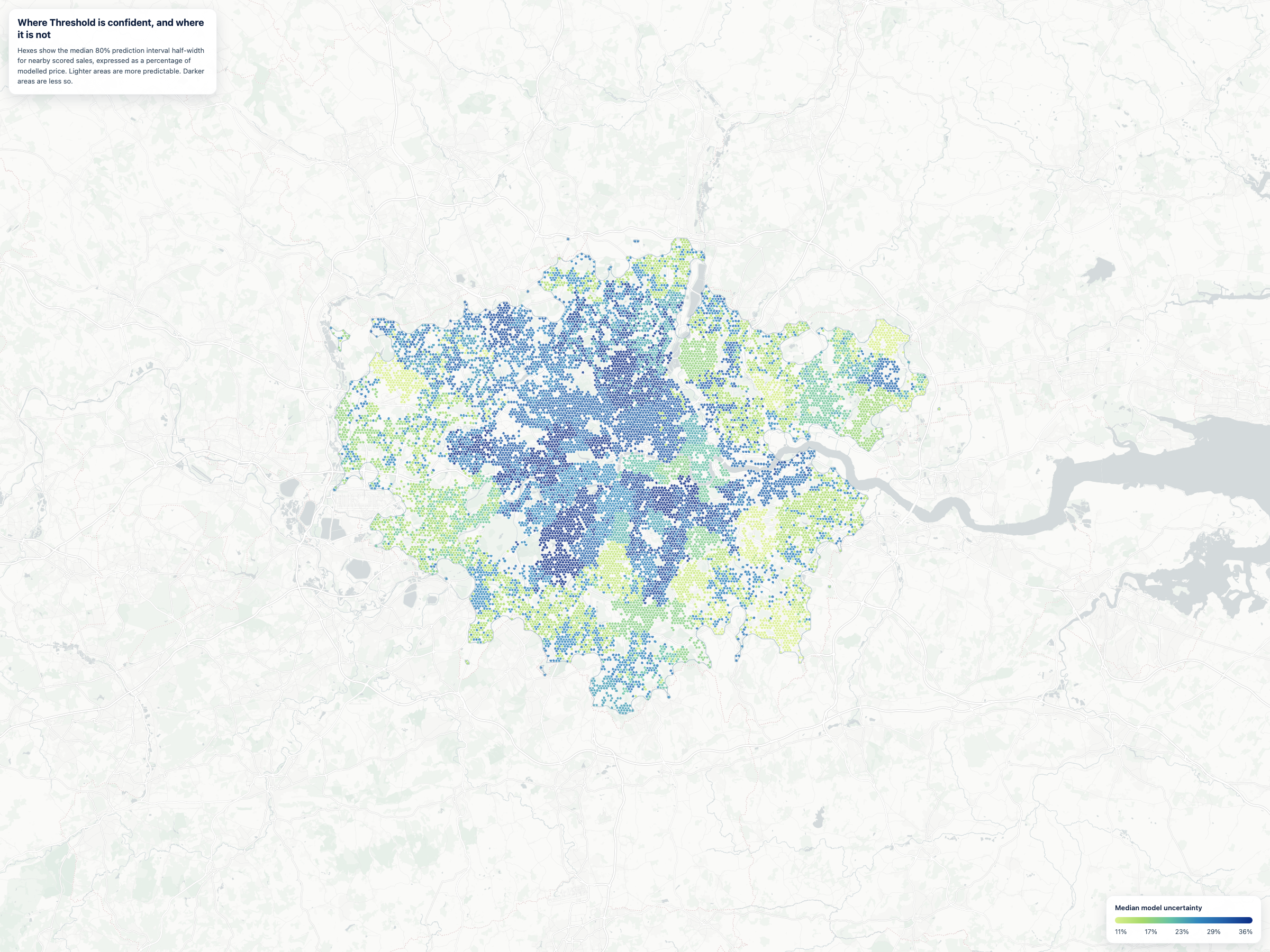
The least confident areas are concentrated in prime central west: Hampstead, St John’s Wood, Maida Vale, Notting Hill, Belgravia. These are exactly the places where a £400k flat can sit a few doors down from a £20m mansion, and where the features the model has access to, floor area, bedrooms, postcode sector, tenure, property type, do not separate the two well. The things that actually distinguish them, period, condition, garden, view, history of restoration, are not in the data.
Outer suburbs are calmly predictable in comparison. Not because the model is better there, but because the property stock is more uniform. There are fewer £20m houses next to £400k flats in Romford.
Closing
These four maps are a way of looking at what a model has learned without telling it what to learn. The patterns were not designed in. They came from the data.
Threshold is live at thresholdvaluation.com. The notebooks and verification artefacts behind these maps are linked below.